


Key Elements of Mobile Filter UX Design
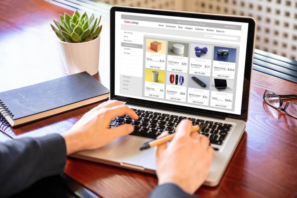
Product filters are essential for helping online shoppers quickly organize product listings and locate what they need. They streamline the browsing experience, increasing the likelihood that customers will return to your site. Satisfied users often become repeat buyers, making filters a key component of long-term success for any online store, including Shopify stores. In contrast to desktop screens with a lot of space, mobiles have a small screen space. Aside from the common ways to filter information, this can make searching more difficult and complex than on a desktop. Designing an effective mobile filter system requires careful planning. While traditional filtering methods are effective, they need to be adapted for smaller screens to ensure ease of use. This article explores best practices for mobile product filters to help store owners optimize their customers' shopping experience.
Optimizing Layout and Positioning
On mobile, efficient layout and positioning of filters are critical. Two common approaches include:
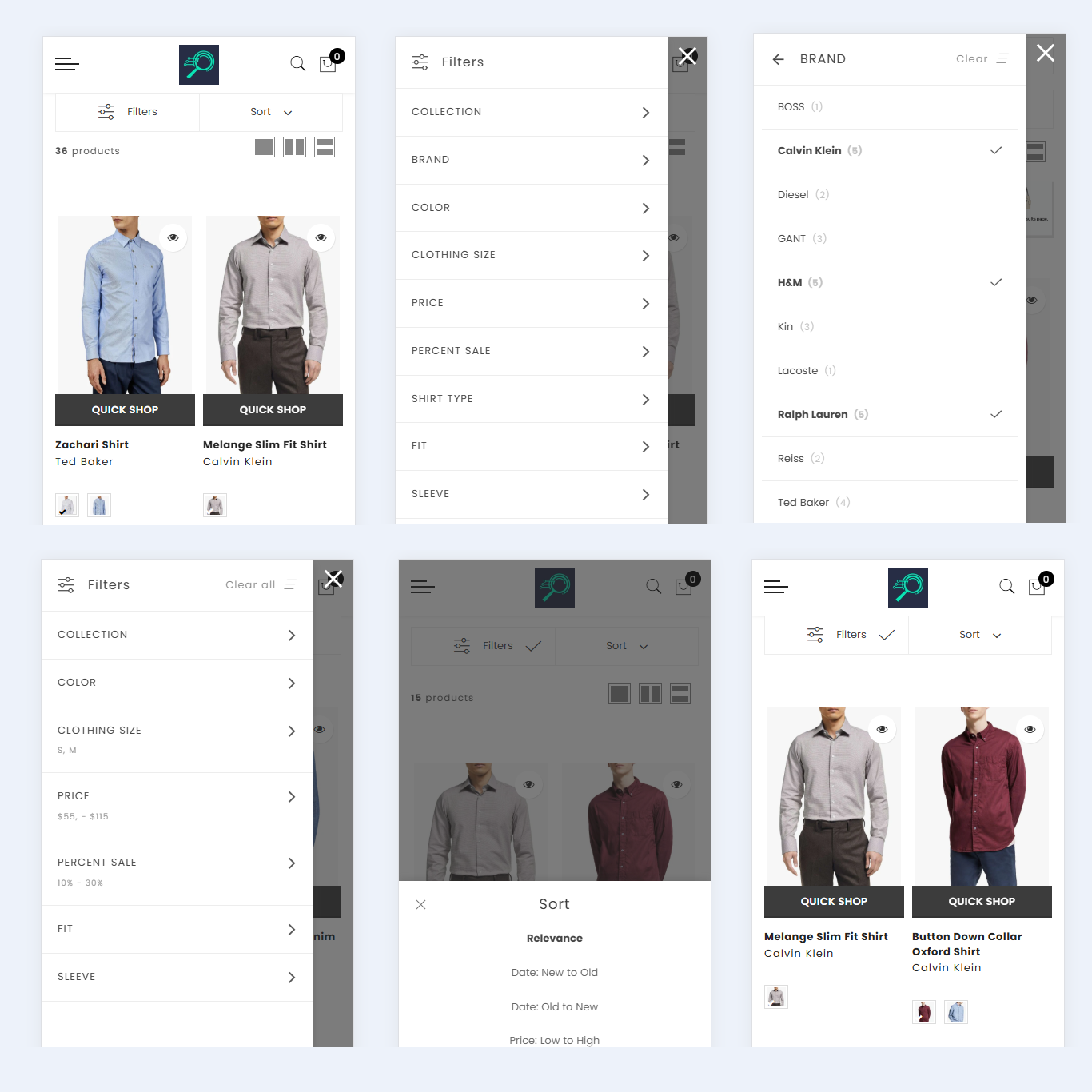
Single Filter Button
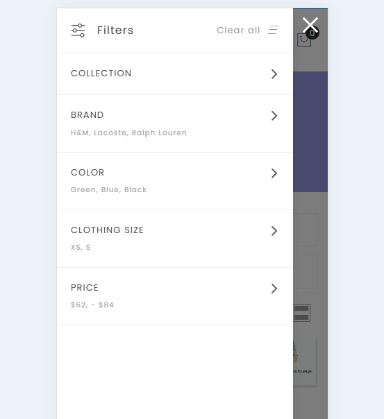
Placing a single "Filter" button prominently ensures easy access to the filter interface, which can be displayed as a modal or drawer. This design keeps the main page uncluttered while offering flexibility to add more filters without overwhelming users.
A single button that is always visible allows users to decide when they need to access filters during their search and provides quick, easy access to the filtering interface. Make it clear that the interface opens as a modal rather than redirecting to another page. Include a prominent "Close" or "Back" icon for navigation and a clearly labeled "Apply" button for added convenience. If space allows, consider displaying a portion of the content behind the filter menu to emphasize its modal nature.
To avoid overwhelming users, focus on a simple, uncluttered design that highlights key filter options. Use concise labels and easily recognizable icons to represent filtering and sorting actions effectively.
When dealing with more complex filtering needs, a filter drawer is a versatile solution. This design groups multiple filter options into a dedicated space, allowing users to refine their preferences without crowding the main page. Side drawers, which slide out from the edge of the screen when triggered, offer a dynamic and user-friendly filtering experience.
This approach maintains a connection between the filter interface and the main content, enabling users to see immediate updates as filters are applied. It provides a seamless and engaging way to navigate through filtering options
Horizontal Scrolling Filters
Horizontal scrolling has gained popularity with the rise of technologies like iPads and the widespread use of smartphones in recent years. On mobile devices, swiping has become a natural and intuitive gesture, making it easy for users to access a website’s content with just a swipe. The adoption of horizontal scrolling can largely be credited to its simplicity and user-friendly design.
Horizontal scrolling is particularly effective for displaying subsets of a category. It works well in situations where secondary information needs to be shown without overcrowding the page. By allowing users to swipe through options within a category or scroll vertically to view different categories, this two-dimensional layout provides a seamless browsing experience.
Swiping is also a more fluid and forgiving action compared to tapping small buttons, reducing the likelihood of errors. Additionally, horizontal scrolling allows users to see all selected filters at once, enhancing usability.
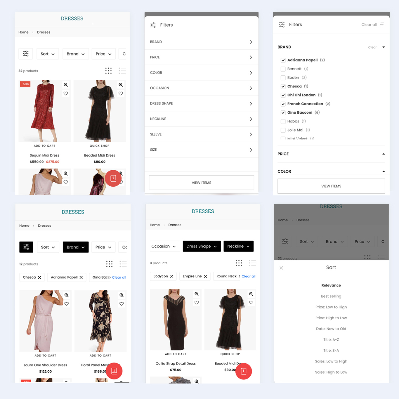
In some cases, filters can be displayed at the top of the screen, providing quick access for frequent adjustments. For instance, an apparel website might include filters for color or price at the top of the page. Instead of opening a full-screen or side drawer filter, these options can expand within the same section, enabling users to make quick changes.
This approach is especially useful for frequently used filters, as it simplifies the process for users and ensures a smoother experience. Designers often incorporate this method to make filters more accessible and intuitive.
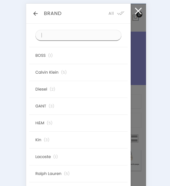
Include Search Functionality Within Filters
Improve the user experience by integrating search functionality directly into the filter interface. This allows users to search within specific filter categories, making it easier for them to locate specific options quickly and efficiently.
Offer instant search suggestions as users type to help them discover relevant options, even if they are uncertain about the exact spelling or terminology. This feature ensures a smoother and more intuitive filtering experience.
Display Applied Filters
When users apply filters and return to the results screen, it’s helpful to display the number of filters they’ve selected. This makes it easier for them to keep track of their applied filters at a glance.
On desktop sites, filter choices are often confirmed with visual cues, such as checkmarks next to selected options. However, due to the limited screen space on mobile apps, it’s more practical to show the total number of active filters. Displaying this number prominently, such as at the top of the screen, ensures users can easily see how many filters are in use without reopening the filter interface. This approach keeps the interface clean and user-friendly while providing the necessary information.
Having a Quick Way to Remove All Applied Filters
When there’s no clear overview of applied filters, removing previously selected filters becomes more challenging. On desktop sites, users might need to scroll through a sidebar to locate and deselect filters they no longer need, which can be time-consuming.
For mobile users, this process is even more cumbersome, as they must reopen the filter interface to remove selections. If the interface closes after each filter is deselected, removing multiple filters requires repeating the process several times.
For instance, with auto-applied filters, removing two filters might require revisiting the filter menu twice, in addition to scrolling through the options to locate and deselect the desired filters.
This added complexity makes applying and removing filters feel labor-intensive, discouraging users from fine-tuning their product searches. Without an overview of active filters—like the one seen on platforms like Amazon—mobile users are forced to reopen the filter interface repeatedly and navigate through filter categories each time they want to make adjustments. This can result in a frustrating user experience.
Conclusion
Designing effective mobile filters requires balancing usability with visual simplicity. By following these best practices, Shopify store owners can create a shopping experience that is not only intuitive but also engaging for mobile users. With thoughtful design, product filters can become a powerful tool to boost sales and customer satisfaction. Whether you’re revamping your store's mobile filter interface or starting from scratch, these guidelines will help you optimize your Shopify site for success.